3 DC-Area Homes With Stylish Aging-in-Place Design Updates
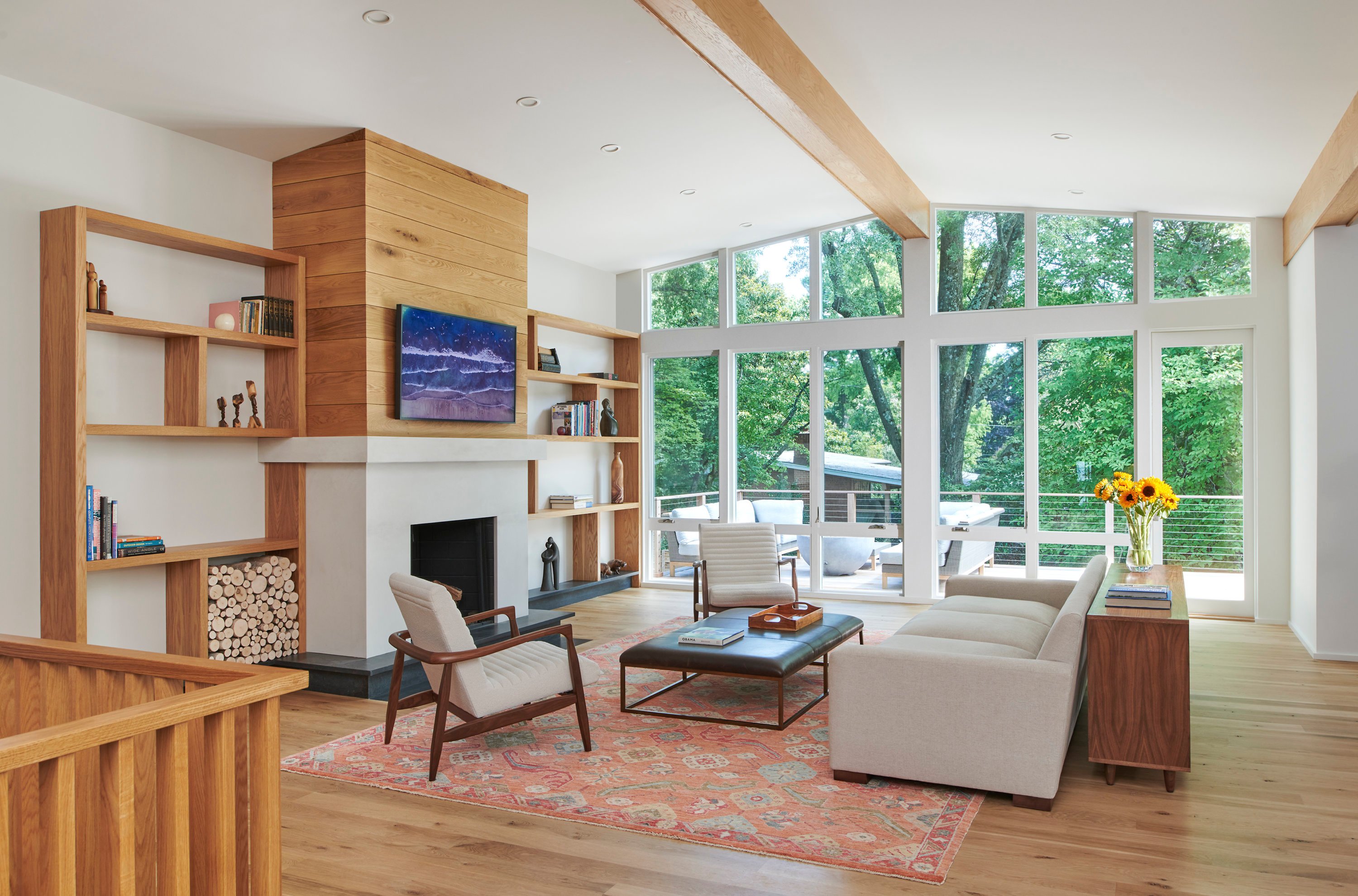
Three stylish projects created with aging clients in mind—such as this midcentury house in Chevy Chase. Photograph by Anice Hoachlander.
Outfitting a home with aging-in-place updates doesn’t have to be a clinical process. Here are three projects that prove accessible design isn’t just practical—it can be exciting, too.
All Accessible, All Style

The owners of this 1958 midcentury-modern house in Chevy Chase wanted it to be their forever home, so they enlisted TeassWarren Architects to make it a better place to age. “We kept the roofline and structure, but for all intents and purposes, it’s essentially a new house on the inside,” says principal Charles Warren, who led the renovation.
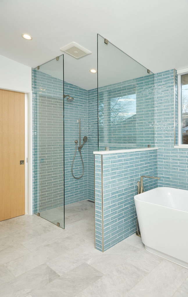
Priority one: making the house easier to traverse in anticipation of future mobility issues. Creating a large primary suite on the main level and expanding the hallways helped, as did making adjustments to the primary bathroom. The team added a zero-threshold shower that allows for wheelchair access, opting for a blue subway tile from Tile Bar that continues behind the wood double vanity, which is a nod to the home’s midcentury roots. And because these kinds of curbless wet rooms are a popular design trend, the overall look doesn’t scream “aging in place.” Other features include an ADA-compliant toilet and a smart shower that can turn on with an app.
Warren stresses that homeowners concerned about future accessibility don’t need to wait or set aside a huge budget to take anticipatory measures: “Universal design components like putting in lever handles, which are easier to grasp than doorknobs, and adding wood blocking for future grab bars are pretty low-hanging fruit.”
Going Up
A couple living in a traditional-style house in Northwest DC’s Kent neighborhood took a whimsical approach to their aging-in-place additions. The husband has balance issues, and they’d already affixed double railings to the stairs, but that wasn’t enough. They needed an elevator, which would help them move safely between floors and lug in groceries and suitcases.
To house the elevator, which required a shaft at least 30 feet tall, the team at InSite Builders & Remodeling designed a two-story expansion at the home’s rear. The addition also accommodates a new entrance hall for the owners’ existing suite upstairs and an office on the main level.
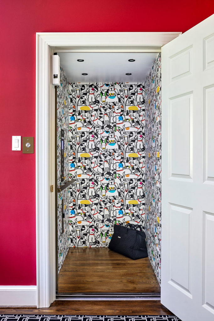
Interior designer Adele McDonald created a cheerful workspace with cranberry-hued furniture and vibrant red walls painted in Benjamin Moore’s “Drop Dead Gorgeous.” The walnut desk has room for a wheelchair to eventually fit beneath it. The dog-loving couple took a cue from the bright office and outfitted the adjoining elevator in a Spoonflower wallpaper that depicts line drawings of colorful canines. “They were looking for something whimsical and fun to otherwise lighten up a serious, functional space,” says Stephen Gordon, InSite’s president. “You can’t help but chuckle when you go inside for a ride.”
From Colonial to Contemporary
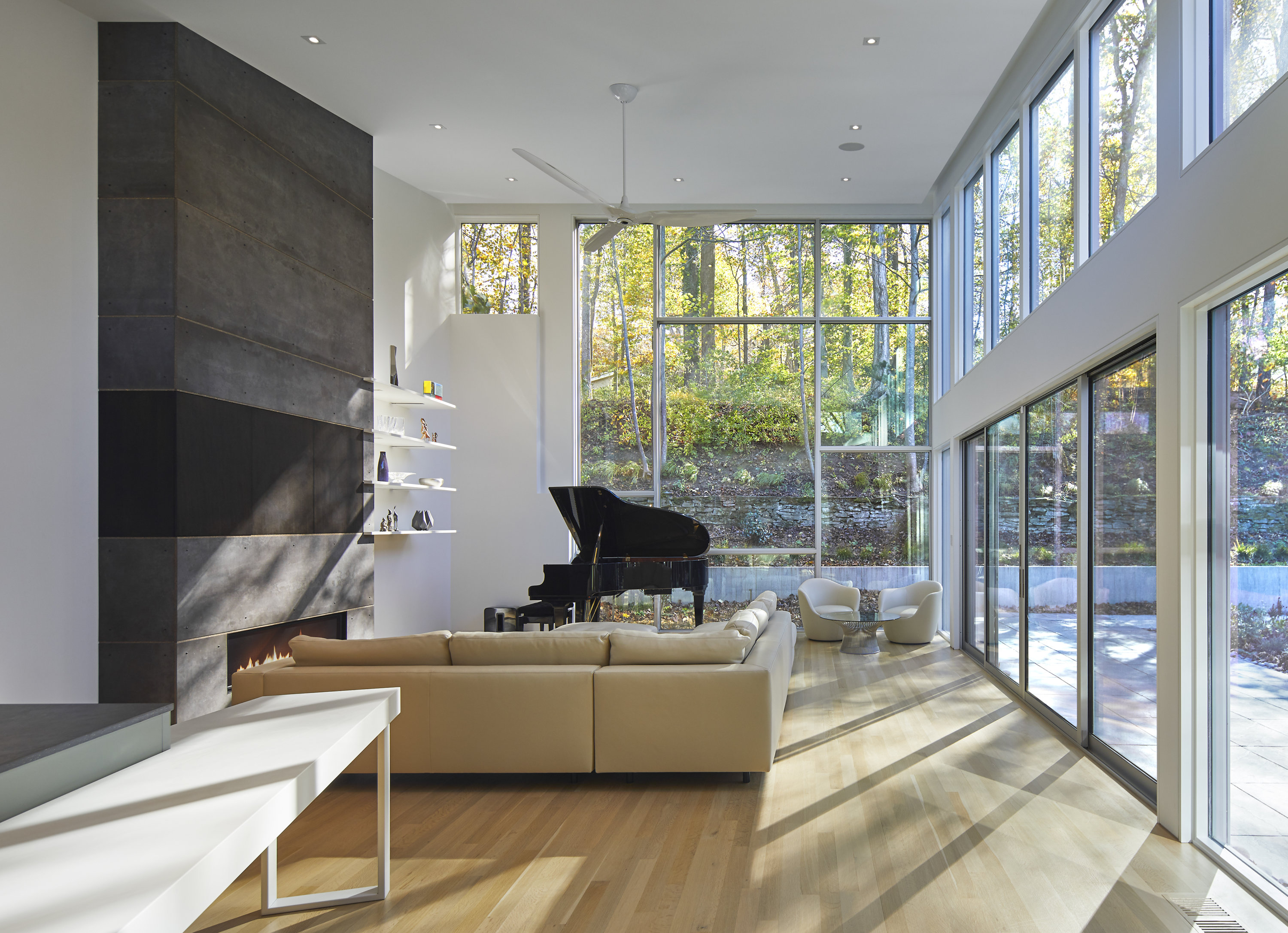
An older Bethesda couple loved their neighborhood so much, they didn’t want to leave. The problem: The hillside property had a dramatic grade, and its steep driveway became treacherous come winter. The 1960s center-hall Colonial also had several exterior and interior steps, with a second-floor primary bedroom—not so good for a couple entering their golden years. Razing the Colonial created an opportunity to build a contemporary-style home more in step with both their changing needs and their tastes.
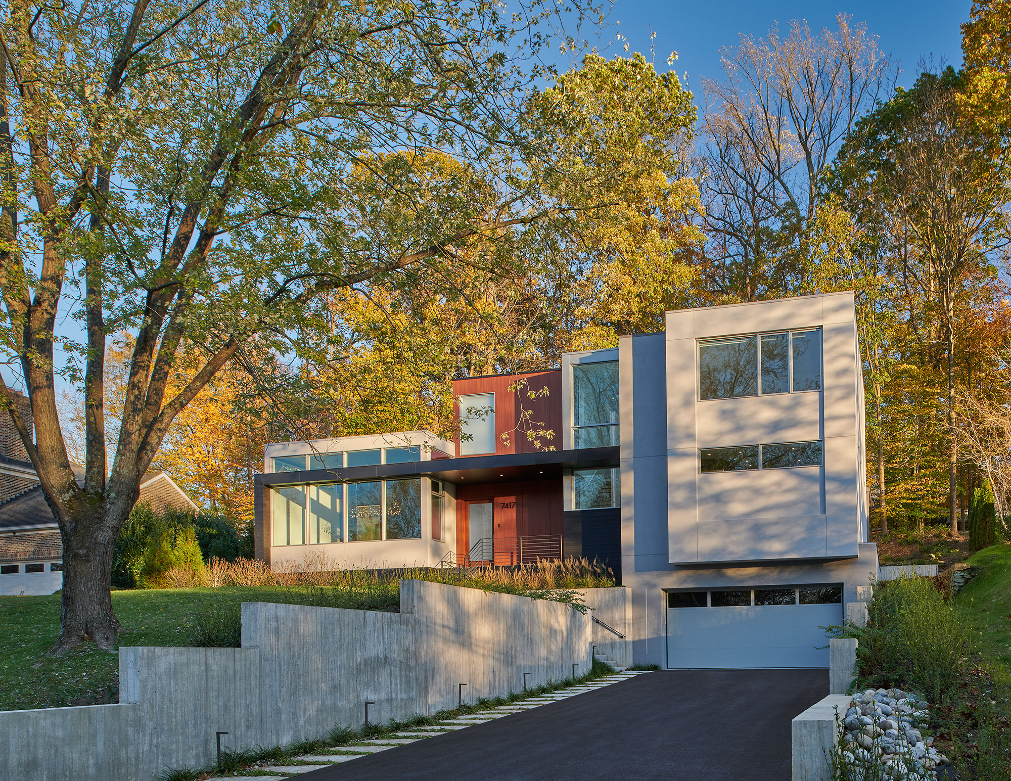
Today, the former house’s choppy layout and small windows have been replaced by a streamlined home with floor-to-ceiling windows. (The rear facade is mostly glass.) This new look serves both design and accessibility: The open floor plan and clear sightlines—hallmarks of modern design—are great for aging clients, says Kube Architecture principal Janet Bloomberg, who helmed the project. “Aside from physical access being much easier, the fact that you can visually see everything and know what’s happening in other rooms is valuable as you get older,” she says. “[That] can offer peace of mind.”
Other adjustments included regrading the property at the garage, entryway, and backyard and widening all interior pathways. The team also framed out a closet for a future elevator and installed automation systems so the temperature, stereo, shades, and lights can be controlled via buttons. And Bloomberg placed the owners’ suite on the main level, reserving the second story for visiting kids and possible grandchildren.
This article appears in the March 2023 issue of Washingtonian.