DeVol Designed a Kitchen for a 17th Century Dairy Barn in Suffolk
We may earn revenue from the products available on this page and participate in affiliate programs.

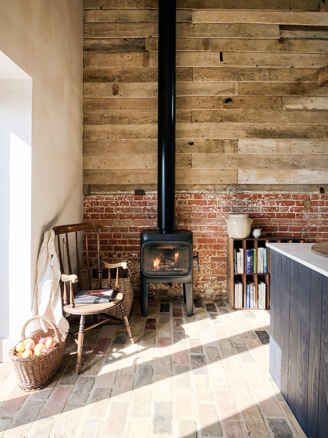
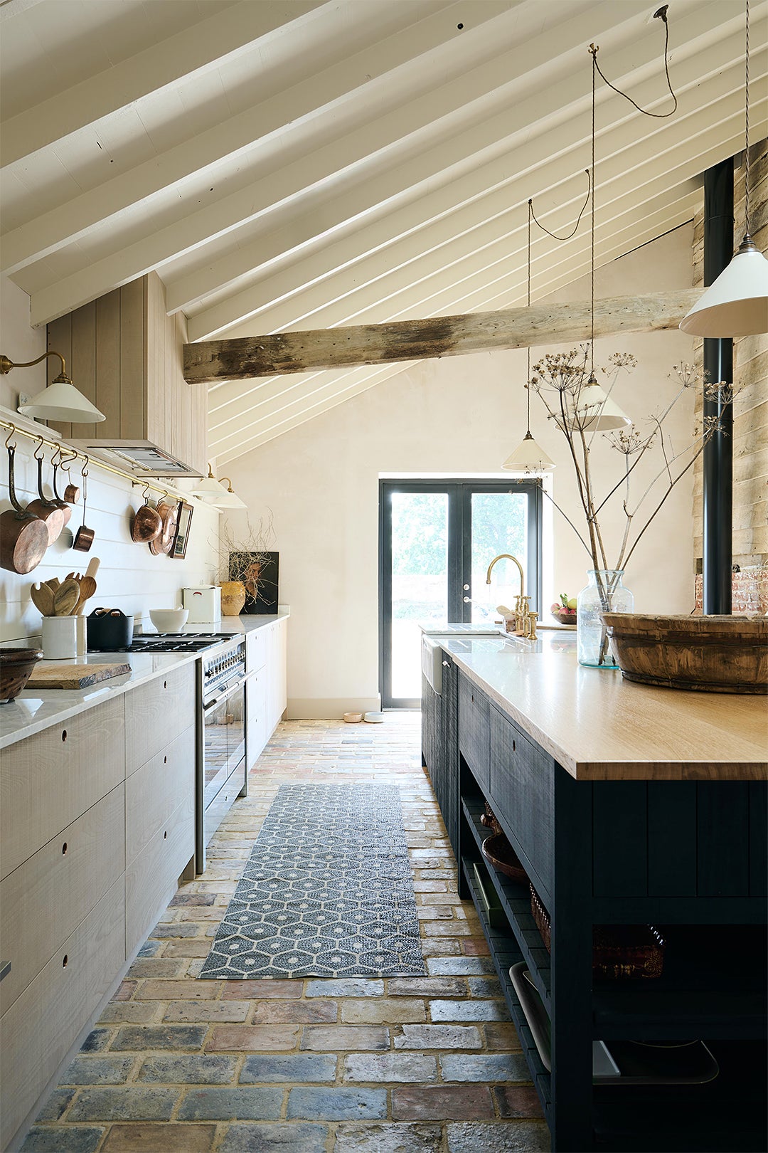
Alastair Coomer and David Breen’s Suffolk, England, kitchen was always meant for welcoming hungry visitors—just not the kind you’re probably thinking of. For the past few hundred years, its guests were cows. A row of concrete troughs once lined the wall where there is now a cozy wood-burning stove; a collapsing roof used to hang over where there is an extra-long island. Nothing about that is surprising when you’ve purchased an unrefurbished, 17th-century barn and want to turn it into a home. “It was in a pretty awful state and suffering from years of neglect,” recalls Coomer. Still, it had two things going for it: the ceiling beams (one of which now slices through the vent hood) and original brick. “We were adamant that the two old beams stay in place even though they no longer perform a structural role,” he continues. “They are great for hanging Christmas lights.”
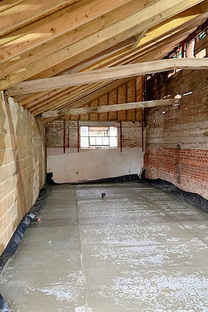
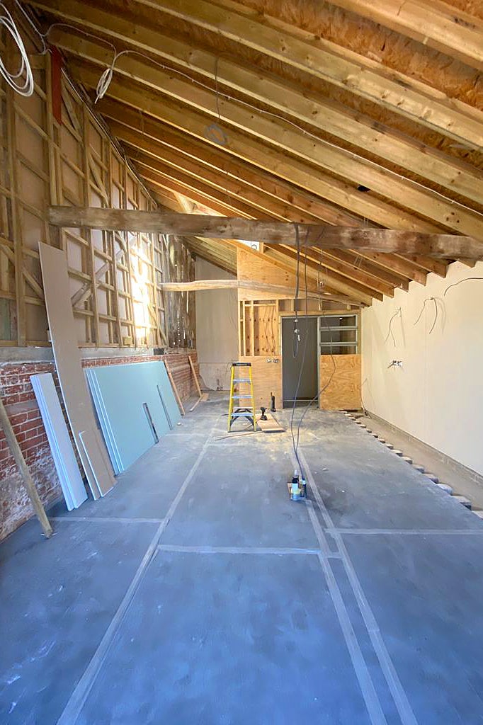
The couple tasked British kitchen design brand DeVol with overseeing the construction of the new space. (You can catch the transformation from start to finish by streaming For the Love of Kitchens on HBO Max, Magnolia, and Discovery+, or peep the progress on the pair’s Instagram feed, @thedairybarndiary.) DeVol founder Paul O’Leary and creative director Helen Parker personally weighed in on the renovation, especially when it came to helping Coomer and Breen mix brick, wood, and stone in the space in a cohesive way. Parker’s advice: As long as everything is a natural material and the tones are generally the same, you can pull it off. Read on to learn more about how they designed a historic-feeling space from scratch.
The Dairy Barn–Cool Cabinets
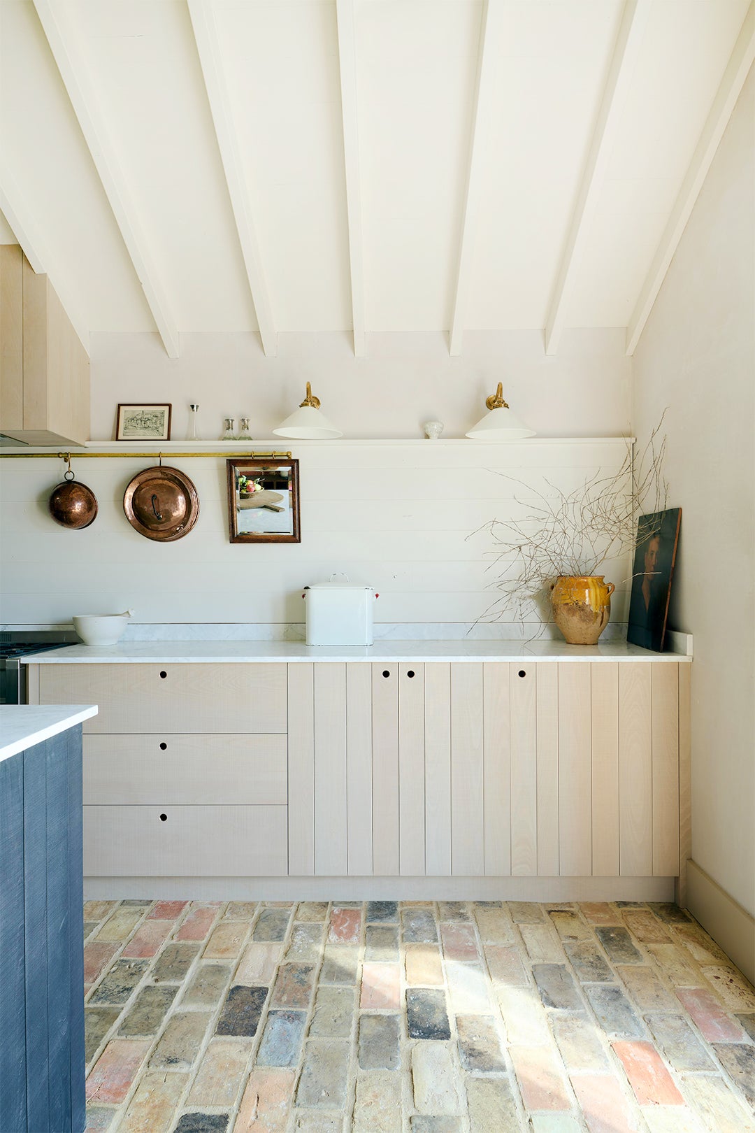
While DeVol is known for its Shaker-style kitchen cabinets, Breen and Coomer gravitated toward the brand’s Sebastian Cox collection, which is void of fussy, ornate details (and even paint). The fronts are stained with the company’s Natural and Inky Blue Black finishes and made out of straight beech planks of varying widths with a sawed, beaded texture. “We were aiming for something that would be sympathetic to an agricultural building,” notes Coomer. In keeping with the barn’s roots, the couple also steered clear of upper cupboards that would “eat into the space” and make it look too new.
The XL Island
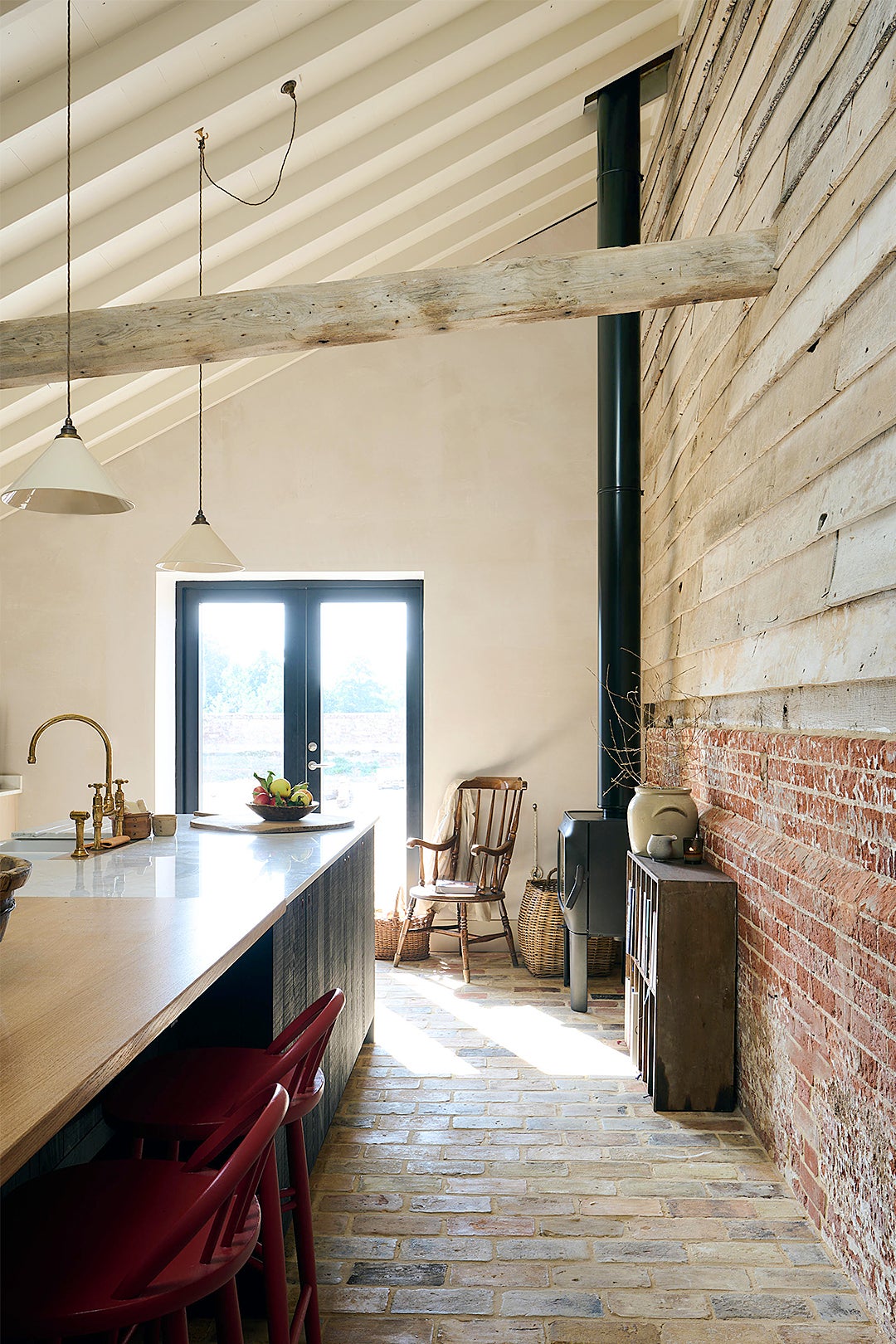
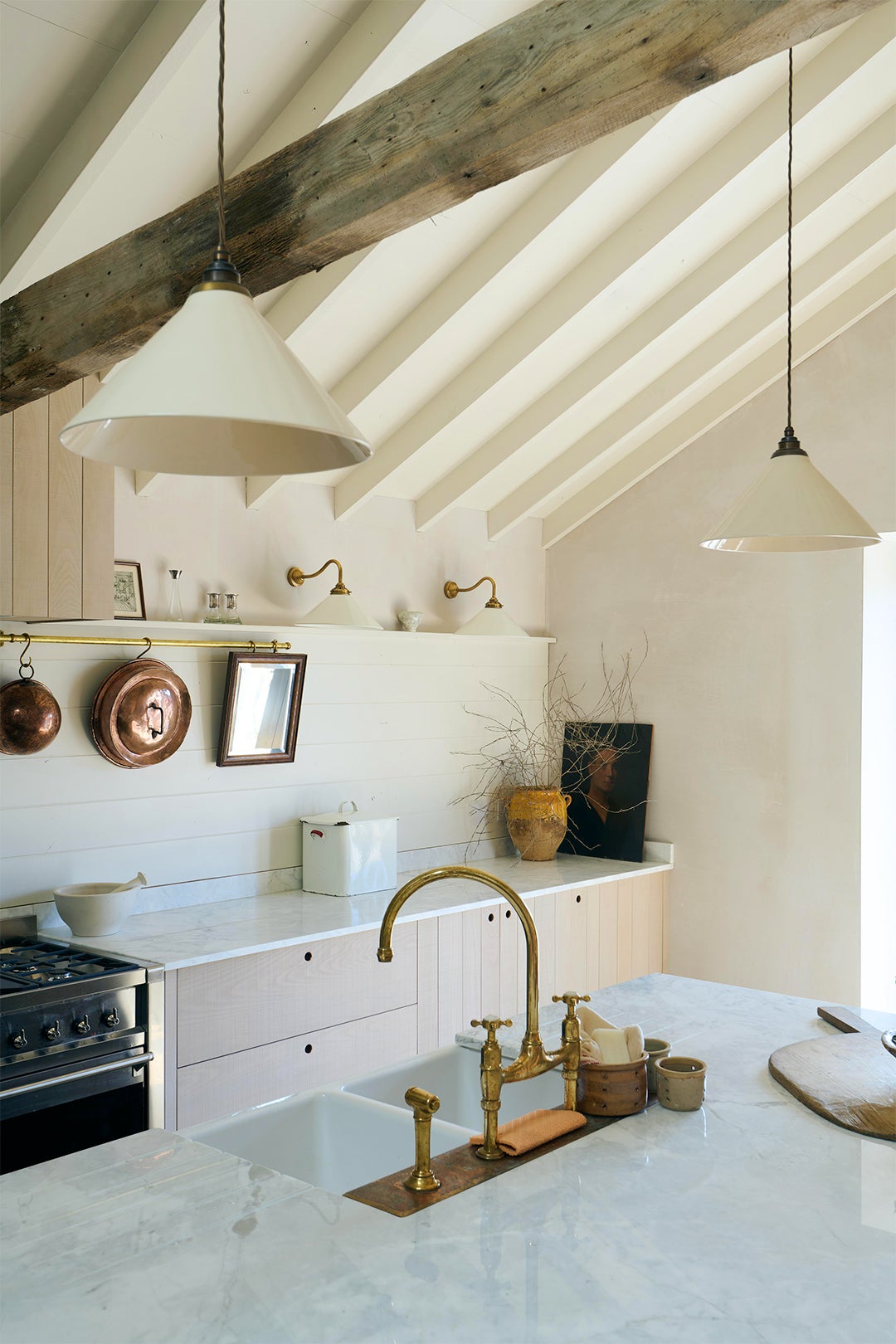
Designing the new island was easily the most challenging part of the process: It spans 13 feet in length and houses a double sink, dishwasher, and room to pull up stools. “We really wanted something substantial, but there was a moment where we panicked that it was just too big,” says Coomer. And indeed, on the day of the install, there were some on-the-fly adjustments needed so the freestanding piece didn’t crowd the sitting area near the fireplace.
In true DeVol style, the finished island is intended to look more like a piece of furniture than a permanent block (O’Leary technically calls it a prep table). “It should look great because it’s going to be in the middle of the room,” he shares in the episode. “You turn around from your cooker and it’s there. You turn around from your sink and it’s there.”
The Dual Counter
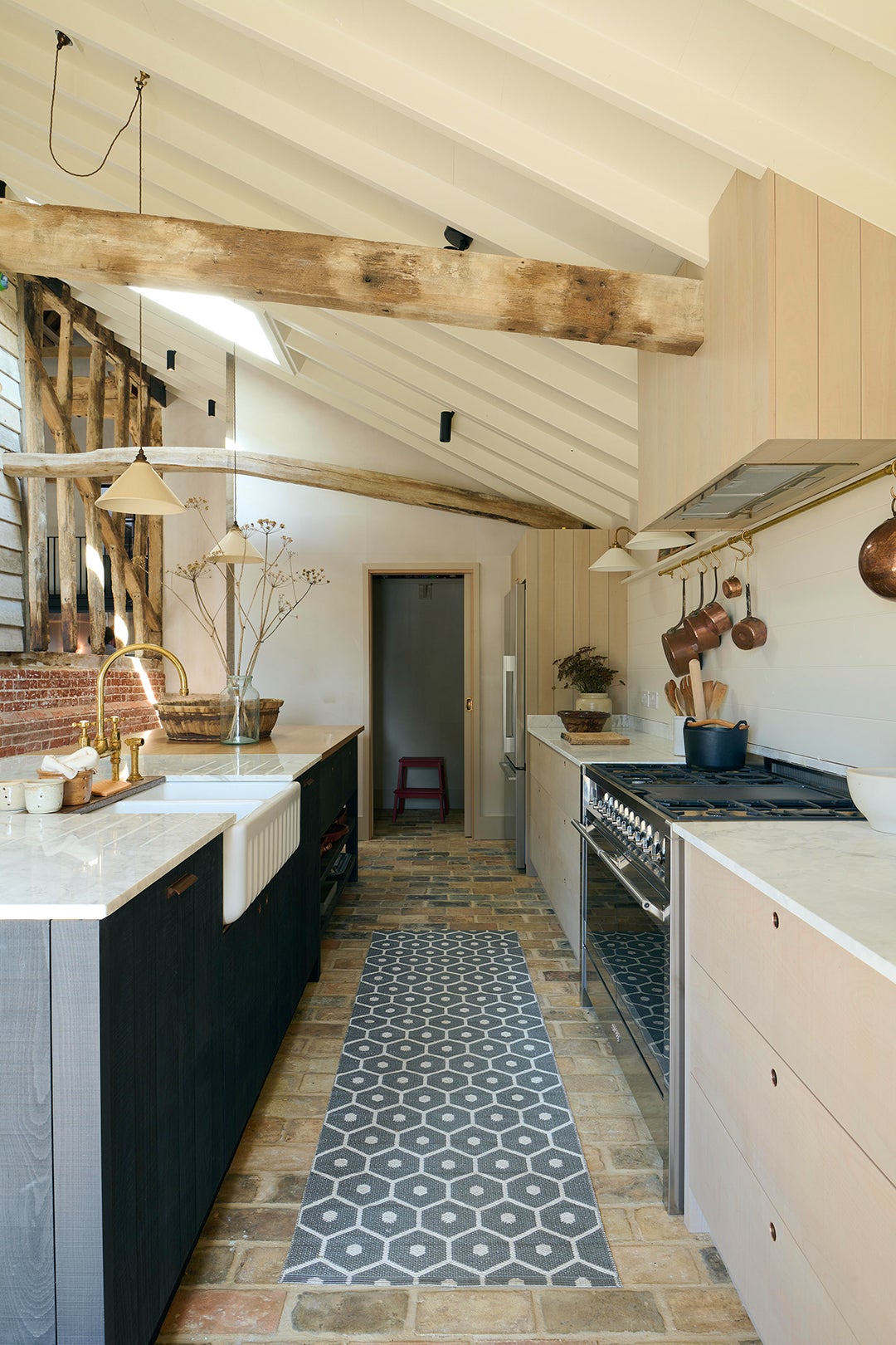
Because the island is so long, there was an opportunity to use two countertop materials without it looking choppy. On the eat-in end, they went with a warm wood worktop that plays nicely with the wall cabinets, while the food-prep side is swathed in marble. Initially, the couple was worried about the upkeep of the stone and was leaning toward concrete, but Parker argued that the two are equally high maintenance. “I think the most important thing is that it feels warm,” she suggested during the planning phase. “Because sometimes in a big open space, you lose that intimacy.” They’ve learned to embrace its patina: “The marble has stained and yet it looks better with each mark,” shares Coomer, even after hosting a housewarming dinner for 30 guests—all humans this time.
