
Three Home Renovation Inspirations for 2023
Guides
Make a resolution to get inspired by these smart makeovers.
Photo by Nat Rea
Maybe you’ve been dreaming of a kitchen or bathroom upgrade. Maybe you need more room but don’t want to move (not with those interest rates, anyway!). You’re not alone: For the past few years, local homeowners have been enhancing their spaces at record rates. Ready to join the renovation revolution? Make a resolution to get inspired by these smart home makeovers.
Garage remodel of a 1958 Lincoln, Mass. home / Photo by Nat Rea
1. The Garage Remodel
A midcentury outbuilding gets transformed into guest quarters and a yoga studio.
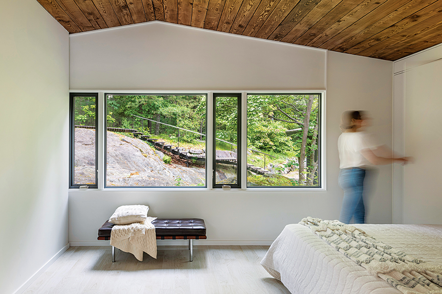
What do you do when you need more space, but you don’t want to disrupt your home’s existing floor plan? For the new owners of this 1958 Lincoln residence designed by noted modernist architects Henry Hoover and Walter Hill, the solution was to transform the garage. “It made sense to convert the adjacent garage, which had a workshop in the rear, and build a separate carport further away from the house,” says Colin Flavin, whose firm, Flavin Architects, drafted the renovation plans. At 769 square feet, the revamped garage accommodates a bedroom, a bathroom, and a large open space for a yoga studio, lounge, and work area. While the garage’s unfinished interior was in rough shape, it had a beautiful structural wood ceiling made of thick Douglas fir that the architects opted to preserve. The original plywood trusses were replaced with steel beams, Flavin says, noting that the element aligns with the midcentury-design approach of Hoover and Hill.
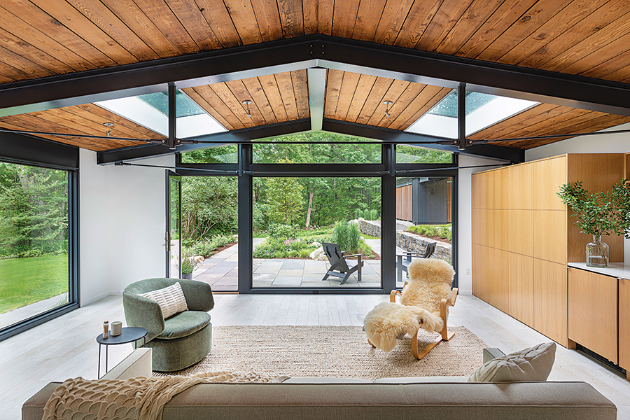
Photo by Nat Rea
- Trim around the windows and doors was painted black to emulate the look of new steel trusses.
- The original garage doors were replaced by a wall of glass that overlooks the wooded setting and provides access to a new terrace and garden.
- Built-in cabinetry and shelving made of vertical-grain white oak provides ample storage.
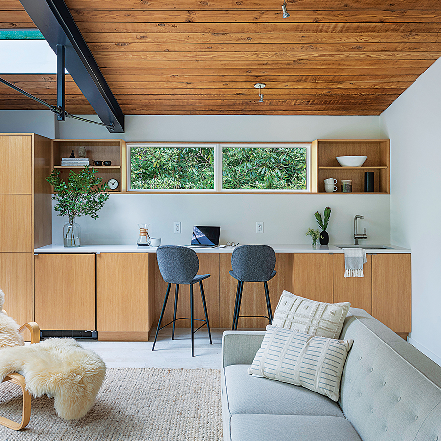
Photo by Nat Rea
- While striking in appearance, the exposed ceiling was uninsulated. To keep heat from leaving or entering the space, structural insulated panels had to be installed from above.
- A highly durable standing-seam metal roof now caps the structure.
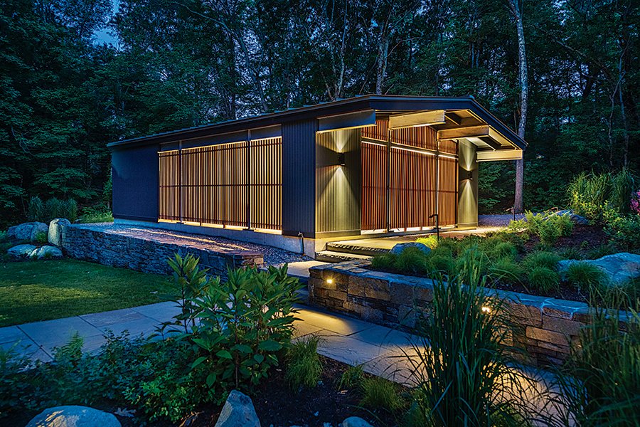
Photo by Nat Rea
- The building’s exterior is clad in painted cedar. “Many of these modern homes in the area were left in a natural cedar finish. Over time, that’s hard to keep up. This one had turned an ugly brown,” Flavin says. “Our client was excited to have it painted a really sharp dark gray that is still quiet in the landscape.”
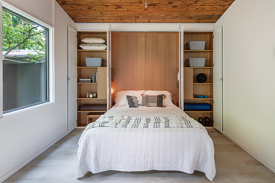
Photo by Nat Rea
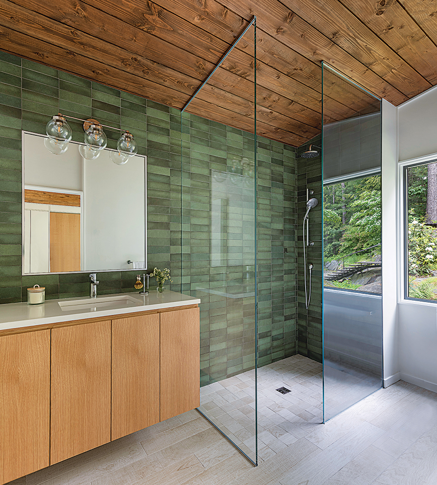
Photo by Nat Rea
2. The Bathroom Expansion
Just say ahhh: Two washrooms become one Zen-like retreat.
With separate his-and-hers bathrooms, the primary suite in this Kingston home presented a unique situation that could make an enticing arrangement for some couples. But Lawless Design’s Hannah Oravec says her clients thought the separate bathrooms were unnecessary, preferring instead to have a large closet and one expanded bathroom. With that in mind, Oravec set about transforming the “hers” bathroom into an ample walk-in closet, while an existing closet was combined with “his” bathroom to create one generously sized washroom. “The homeowners really wanted a spa-like bathroom,” Oravec says. “A space that was calm and Zen, light and bright. There is great natural daylight in the home and an amazing landscape outside, so there was also a focus in the renovated bathroom on bringing the outside in.”
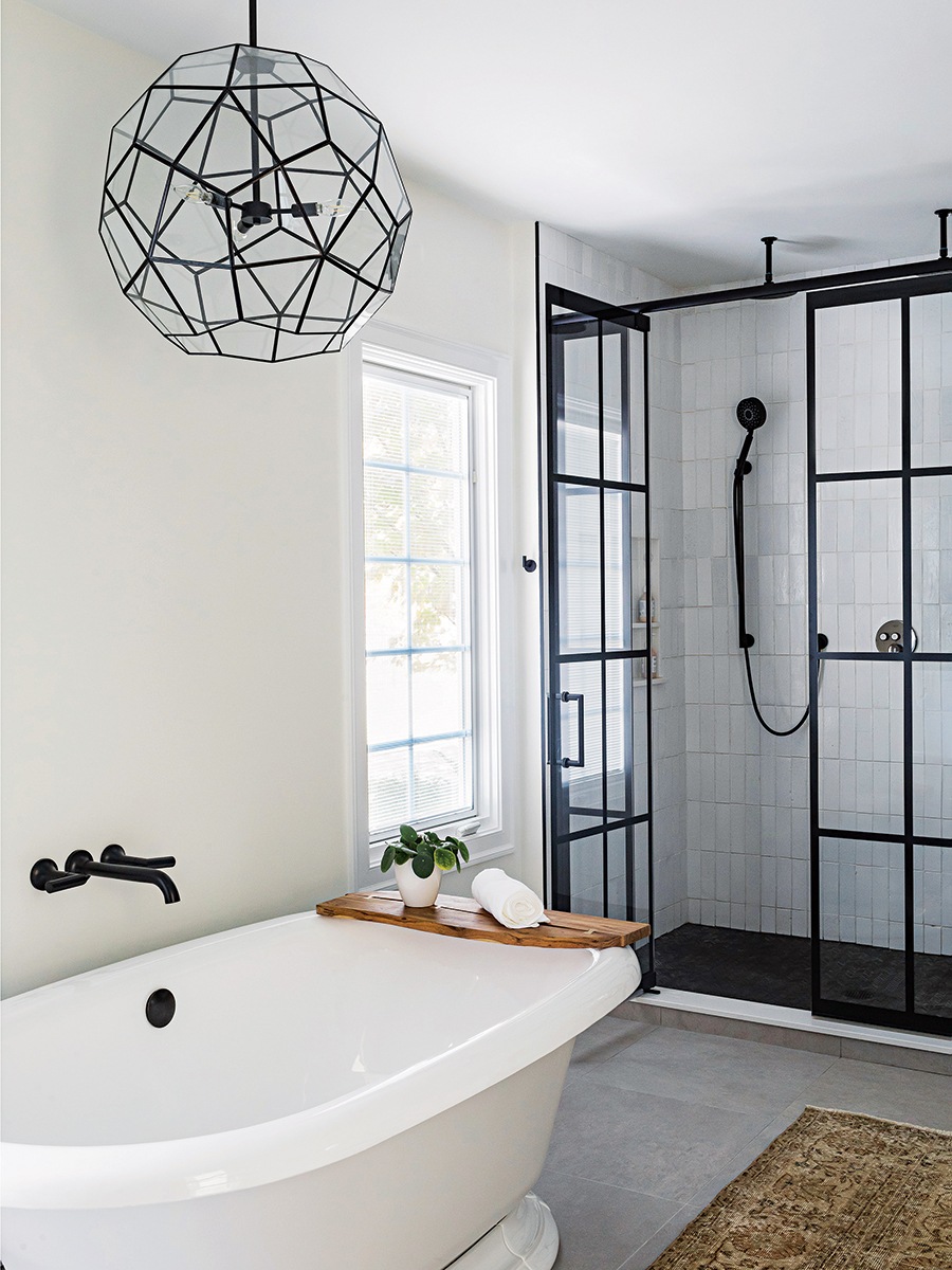
Photo by Joyelle West
- The spherical Pottery Barn light fixture adds another shape to the room, along with a bit of whimsy. “They wanted the room to have things that felt fun,” Oravec says.
- The color palette centers on white—walls are painted Benjamin Moore’s “Alabaster”—with matte-black hardware and accents.
- The soaking tub from the “hers” bathroom was reinstalled in the new space on the other side of the room.
- For the flooring, Oravec selected porcelain tile that resembles concrete.
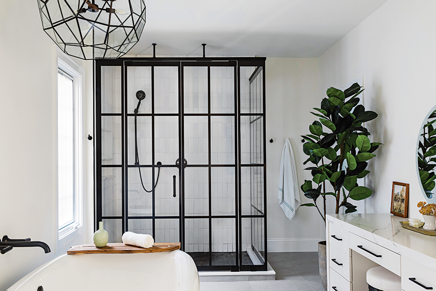
Photo by Joyelle West
- A walk-in custom shower was inspired by the couple’s experience living in England. “The multipane doors nod to the style of British windows,” Oravec says.
- Topped with quartz counters, the sink vanity and an additional smaller makeup vanity were made by Vartanian Custom Cabinets.
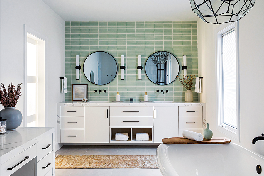
Photo by Joyelle West
- The wall behind the vanity is sheathed with sage-green Fireclay tile. The hue was selected because it recalls the verdant landscape seen through the room’s windows.
3. The Kitchen Makeover
An enhanced layout and mod aesthetics prime the heart of this home for its next century.
When Jodi Swartz of KitchenVisions first saw this 1924 house in Belmont, she says it was practically abandoned. Though it had good bones and a striking stucco façade, “Inside it was a wreck, dark, and everything was just so old.” The new homeowners hired her to renovate the bathrooms and carve out a mudroom, along with a bath for their dog. “They were going to keep the kitchen as is for a while,” Swartz says. “But it was cobbled together, and there was no rhyme or reason to the design whatsoever.” Eventually, Swartz and contractor Nathan Dishington of Jensen Hus crafted a renovation plan for the kitchen and presented it to the homeowners. “We wanted to show them how great it could be,” she notes. Indeed, their clients embraced the concept, which called for bumping out the front wall 4 feet; creating vaulted, cathedral-style ceilings; and closing off a non-essential back door to create a walk-in pantry. The rest is history.

The renovated kitchen of a 1924 house in Belmont. / Photo by Michael Patrick Lefebvre
- Not wanting to waste the existing white-oak cabinetry, Swartz used the wood in other parts of the house, including the new kitchen island.
- Topped with a 3-inch-thick Neolith “Basalt Gray” quartz counter, the 8-foot-long piece includes a prep sink, built-in microwave, and several cabinets.
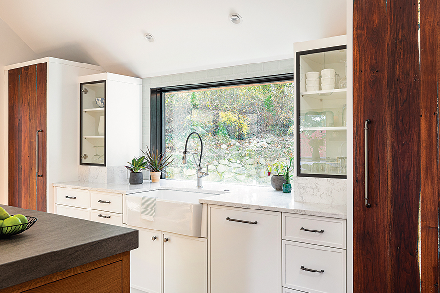
Photo by Michael Patrick Lefebvre
- By bumping out the wall at the front of the house, it was possible to install a large window, cabinets, and the main sink.

Photo by Michael Patrick Lefebvre
- The tiled backsplash is crackled Grigio porcelain in a pale-green hue. The counters around the perimeter are made of quartz.
- To enhance the room’s airy feel, very few upper cabinets were installed. Instead, slide-out drawers store pots, pans, and dishes. “But cups and mugs really can’t be in drawers, so we created the open upper walnut shelves,” Swartz says.
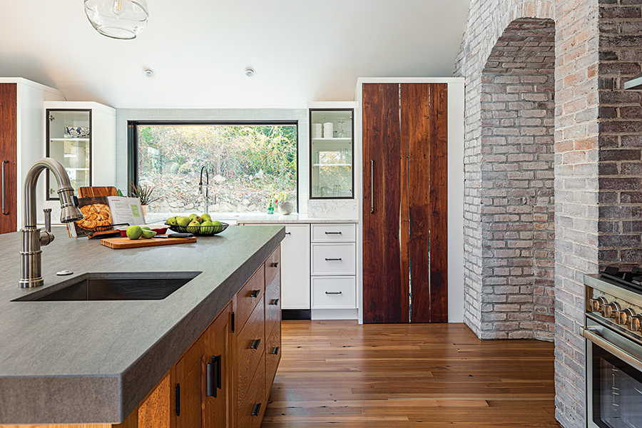
Photo by Michael Patrick Lefebvre
- The Sub-Zero refrigerator and freezer are clad in reclaimed, distressed walnut. “There is a subtle turquoise undertone to the wood,” Swartz says. “It must have been painted at some point and rubbed off.”
First published in the print edition of the January 2023 issue as “Goodbye 2022… Hello Reno!”